PHOENIX group Logo
Correct use of the logo
The logo is the brand name with logo mark, and is used for the following:
- Communicating group topics
- Communicating from an HQ function
It is the core element of our corporate design, and must therefore be displayed on all communication materials. The colour of the logo is Corporate Green on a white background. For items printed in monochrome, the logo is black. The negative of the logo is white on a Corporate Green background. All other colours are not permitted.

Corporate Green logo on white background

Black logo on white background

White logo on Corporate Green background
Incorrect use of the logo
Do not alter the proportions or placement of either the brand name or logomark! The logo should not be placed on images or other patterned backgrounds.
Co-branding using the PHOENIX group logo is generally not permitted. This applies to all documents types, including letterheads, business cards, presentations, etc. as well as digital channels. Exceptions to this rule can be made for internal, PHOENIX-only events.
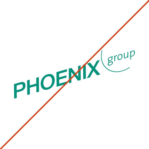
Don't
Do not alter the logo proportions.
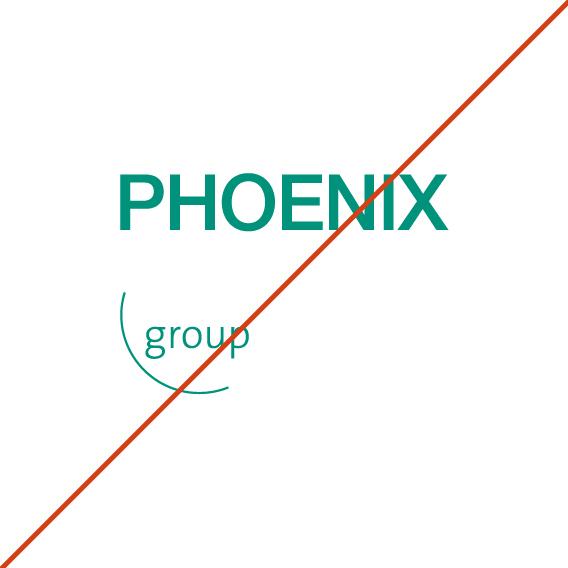
Don't
Do not cut up the logo into different parts.

Don't
Do not use the logo on photos or other patterened backgrounds.

Don't
Do not use the logo diagonally or on differnet colored backgrounds.

Don't
Do not alter the prportions of the logo or use on different colored backgrounds.
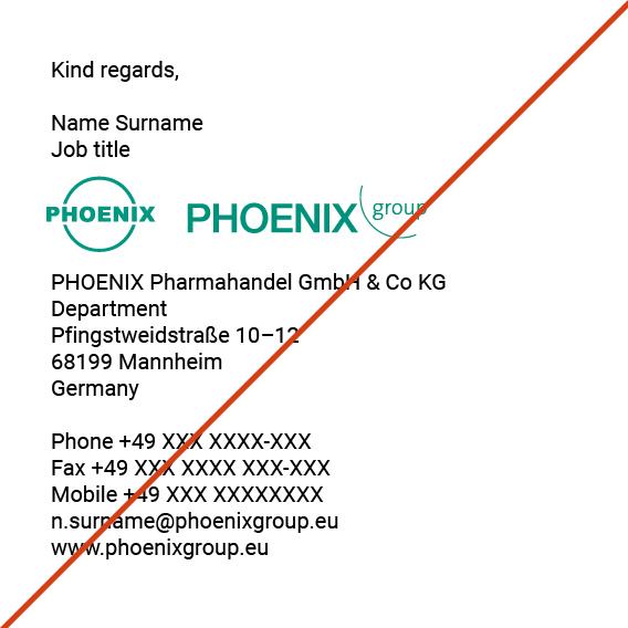
Don't
Co-branding using the PHOENIX group Logo is not permitted.
Sizing and spacing of the logo
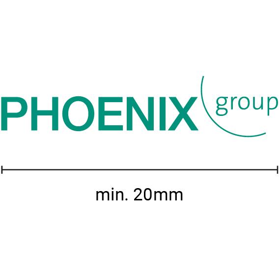
Minimum width of the logo is 20mm
To ensure a non-pixaleted logo and good visibilty the minimun width of the logo on all assets, digital and print, must be 20mm or over(bigger?).
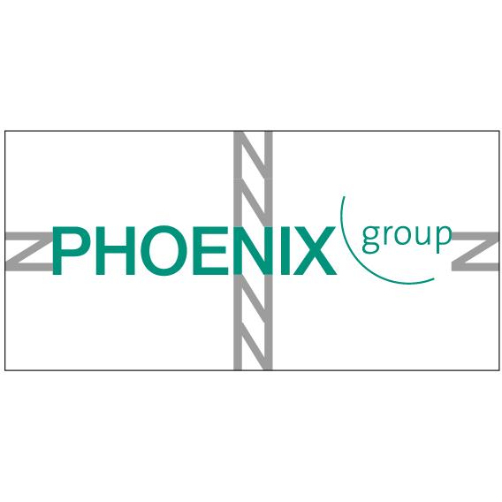
Spacing of the logo
No elements may be placed in the clear space around the logos. For the PHOENIX group logo, this clear space is one cap height to the right and left and two cap heights above and below the brand name.
Any feedback or questions?
Please contact us if you have any questions, feedback or any other issues relating to design of the PHOENIX brand.